Part 3 - Painting a Four Stretched Canvas Panel Project
Laying in the details and characters across multiple canvas series. The goal, a seamless visual story. Here's Part 3 - Painting a Four Stretched Canvas Panel Project Final.
5/3/20244 min read
Creating a single painting across multiple stretched canvas panels can feel daunting the first time. Read Part One and Part Two in this series to learn successful setup and prep for multi-panel art. Followed by perspective, color management, and storytelling.
Use your tools to save time and play with ideas. Anytime in the process.
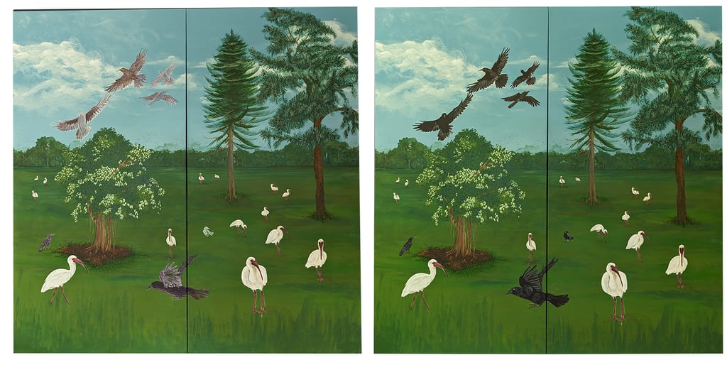
Taking a photo of your current work-in-progress and importing it into your favorite software saves time and reveals any weaknesses you are working into the painting you can't see. I often flip these horizontally and look at them. Sketches and anatomy studies as well. The mirror of your art immediately reveals the things that aren't quite right. Your dominant hand will skew just a little. The mirror reveals where that little is hiding.
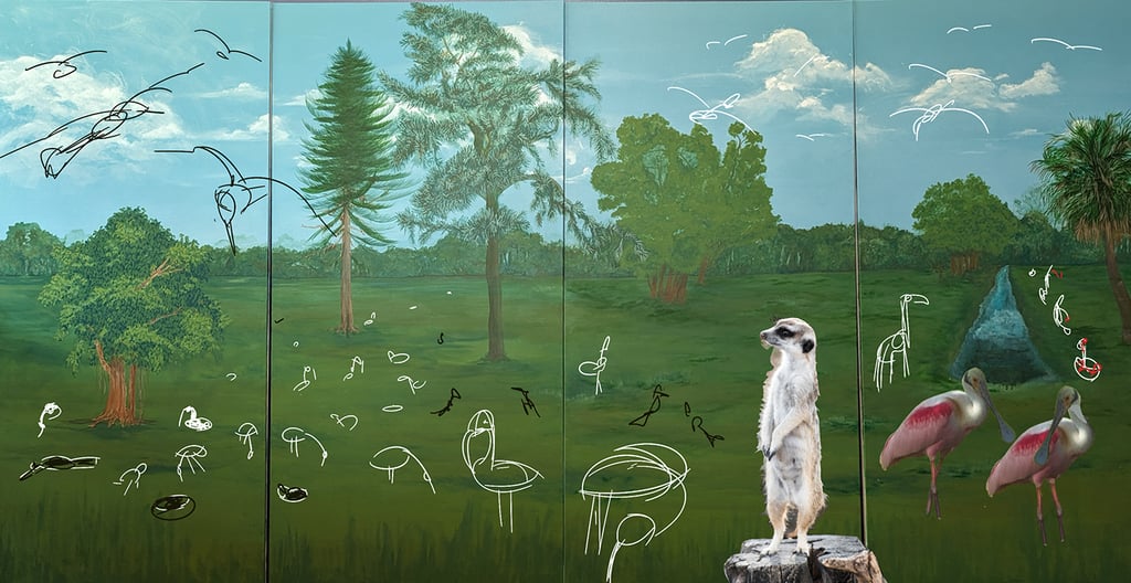
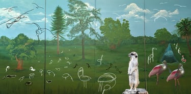
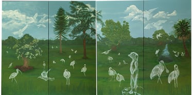
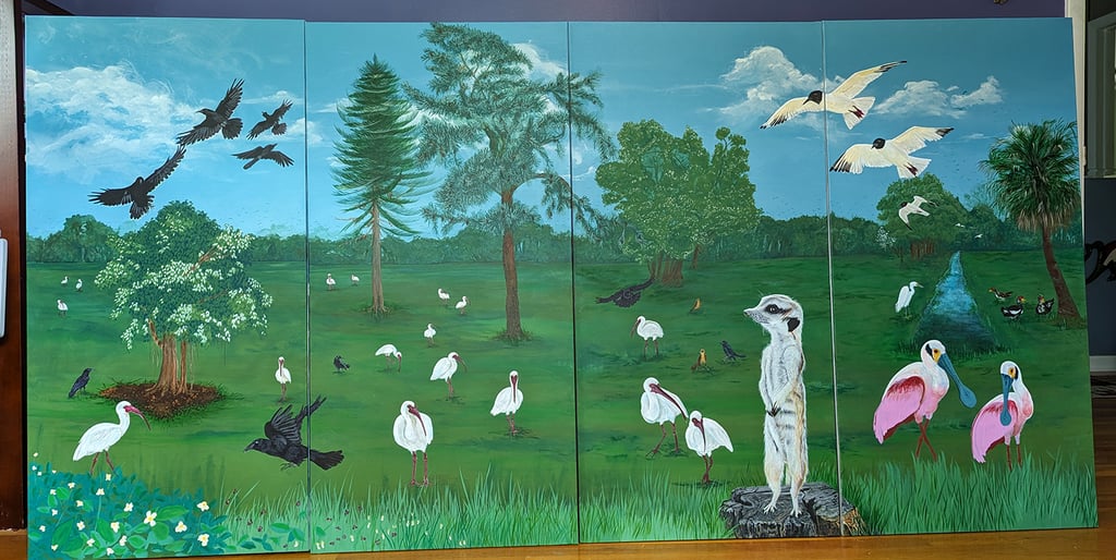
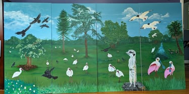
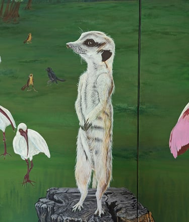
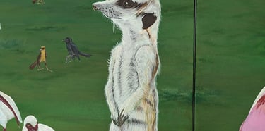
When Mitch the Meerkat was requested during design development the ability to move, remove, resize, or shift characters to accommodate took no time at all. I use both sketching, and photos at this time. This is my favorite time of painting. Placing and moving elements exactly like I did when I was a little girl playing with my ColorForms.
Sketch on your painting in white chalk.
Once you've settled on things, try using a white chalk pencil to sketch directly onto your painting. You can erase with ease. A damp soft cloth does the trick. Paint directly over the chalk without worry. The chalk doesn't affect your paints, but disappears completely.
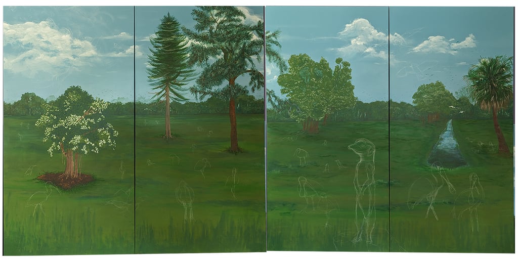
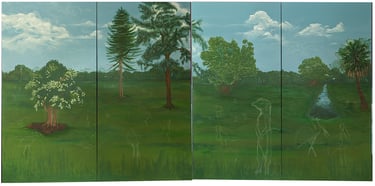
Paint a watery wash of volume with titanium white.
I've always favored working in white when creating volume and shade lines. When painting I'm adamant about that idea. Laying in these assets with a darker color will setup a challenging canvas to paint on. Not only are your finished areas dampened visually, but bringing the new assets up and out into their rightful place visually could be skewed. You may find otherwise, and I suggest you try both ideas to see where your work needs you to be. There's only the right way to paint for you. This is my way. Find your way through experimentation.
Paint a watery wash of layers to build the volume of your characters.
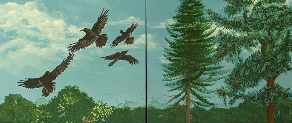
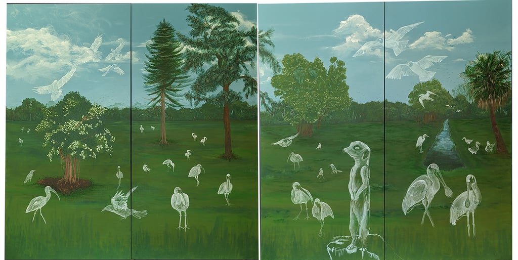
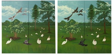
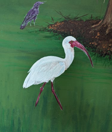
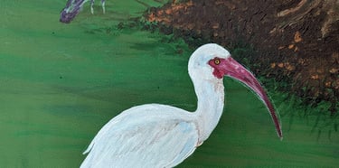
The crow in Vista in Blue were painted in washes of three grey values, dark purple, and dark blue. On average each bird required a dozen overlays.
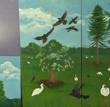
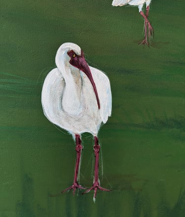
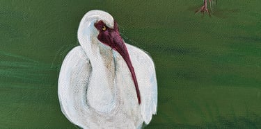
After overlaying washes of colors for depth and light I lay in thicker strokes of the brush for a final boost of realism. The larger ibis were a dozen overlays of white values using cobalt blue and burnt umber. Mitch Meerkat was a dozen overlay washes of whites using cornsilk yellow, ochre, multiple grey values, and meticulous detail work in titanium white with my favorite sable angle shader brush. That brush is like my 5-iron. I can get away with a lot.
One last thought.
You'll always see what you could have done better. You'll always feel you could have done something differently for a better result. But you'll also see things you love. And results that will surprise you at a distance. Particularly a distance of time. I spent months of Vista of Blue. And typical of me, today, I hate it. I don't want to look at it. What I see right now is everything I struggled with during. The pressure points where I decided to leave the area knowing it was done as well as my current skills can take it. It's the familiarity of all those moments that an artist dislikes, not the art. It is normal to feel this way.
After I publish a title, I can't look at the manuscript, or read the proof copy of the book. I can't even open the thing. Even the title is annoying. Because I recognize every point of pressure, contention, decision, and editing. It takes a full year before I can read one of my books. And I do read them, though. After a year. To see where I've improved, where I can still improve, and to admire the fact I wrote, published, and sold a book.
Look at your painting after a month. You will see the painting. Where you've improved, where you can still improve, and you'll be able to admire the fact you created art. Out of thin air. Which is something to be very proud of. Celebrate. You are an artist!