
How to paint an interior mural step-by-step.
You can DIY a beautiful wall mural of your own. Here's how to paint an interior mural step by step. From design, to brushes, types of paint to finished art.
Kathy LaFollett
1/17/20247 min read
First mural? You got this.
What you'll need.
Use the Golden Ratio.
Color.
Perspective.
Simple Background. Middle ground defines movement.
Foreground moves the eye.
What tools do you need to paint a mural?
Better question, where do you shop to get supplies at the best price? I’ve used Jerry’s for years.
Brushes. Thicker, tougher brushes for broad strokes and extensive background work. Synthetic and bristle art brushes work well for the background work. You’ll also want a set of natural or blended natural detail brushes. To paint smaller areas and subjects. Don’t feel compelled to buy the most expensive, but long handled mid-range. Interior paint is hard on brushes. It’s likely you’ll not use these again, if the wall is large and the surface rough. I buy new brushes for each project.
When do you know your brush is ready for replacing? It can’t keep a point when wet. The larger brushes can’t keep a sharp edge when wet.
Why don’t you use acrylic artist’s paint on an interior wall? Personally, I do not use artist’s acrylic because I am painting a wall. Not a canvas hanging. A wall lives a different life than framed artwork. I use Baer interior low/no VOC. Matte, semi-gloss, or gloss. They all have a purpose depending on the project. Duly note that semi and high gloss is a completely different viscous paint by nature. You’ll need less water to mix colors and clean your brushes. If you use the glosses, be mindful. A room with strong morning or afternoon light will create a glare on your work, which is a consideration.
After brushes, you’ll need the following tools.
Paper plates to use as a paint pallet to mix colors. Nothing beats a waxed paper plate for paint color mixing. Seriously.
Painter’s rags found at your local big box home improvement store. I prefer the recycled variety for texture, absorption, and how they stand up to the day’s processes.
Paper towels. Especially the pick-a-size variety that lets you tear half a sheet, rather than a full sheet.
Painter’s tarp or rolled paper to protect your floor. I prefer the paper paint taped down. You won’t be fighting the floor as you go from one area to another.
Step stool or ladder.
Soft pencils or hard charcoal to draw out your design on the wall. If you’re working on a wall with a color finish already, white chalk is a great sketch tool. You can erase with a wet paper towel.
Painter’s Tape.
A water source for cleaning brushes and refreshing your water jar. Always keep your mixing water clean. That’s a good habit to get into.
Where to begin? The idea. Your idea is actually a story. What’s your story?
Don’t let a white wall bully your imagination. It’s your house. If you want a giant mushroom with mice having a tea party on top, so be it. And since I mention that that’s a great story! Five mice, meet for tea on their favorite mushroom each Tuesday. Tuesday because the owner of the lawn that the mushroom grows in mows on Monday. Leaving a beautiful view of the pond beyond. Now you’ve got lots of details you could bring into that mural. Choose well, choose them all!
Let colors fly. Let shapes and surprising thoughts find a home in your sketchbook. I taught K-6 art. My kids would find their seat first day of the year. I would announce, “Welcome to Art Class! You all have an A, right now.” Why? Because there are no wrong answers in art. We all start with an A. Don’t let anyone tell you your talent is a C.
Use the golden ratio to make your idea inviting.
Perspective makes all the difference. Horizon line. Vanishing point.
Paint your background simple, clear, with washed faded color strength. Walk outside and look at the first thing that catches your eye. Keep that focus. Take in your peripheral vision information. Blurred, but you can make out what’s there a bit, by color and shape.
Middle ground will need stronger colors with a bit more detail for information. That item you’re looking at outside right now? What of the thing right next to it? You can see it, and there’s a bit more color and detail giving you information. Additional detail slows the viewer’s eyes and leads them through your mural’s story.
Foreground moves the viewer’s eye through the work. Where do you want visitors to look at first, second? Here, the golden ratio comes in. Details and characters lead the way through and to the background and back again to the leading character.
Color.
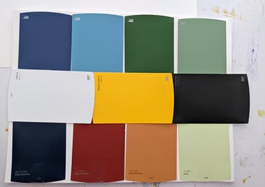
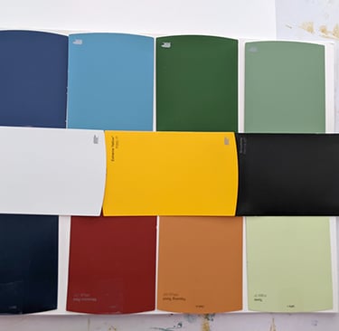
Not as complicated as you think. There’s a great free Color Wheel app here. An interactive way to find your two top colors, all other colors will derive from them for a rich mural. Never use pure black. Never use pure white. They will dull the action of your art.
(I’ll be writing an article about how the wall of paint chips at the paint store help you stay inside a color family for contrast and compliment.)
Follow my process through the following photo sets. Click on the graphic to enlarge the photo.


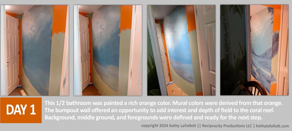
The 1/2 was painted an orange. All colors were derived from that orange. Color Theory is not as complicated as you think. There are a number of free color wheel apps online. And you can use the paint chip displays at your local paint store to 'stay in the family' of colors. I'll write an article to explain the surprising system you probably didn't know existed to help you. Pro Tip: Never use pure black. Never use pure white.
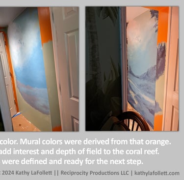
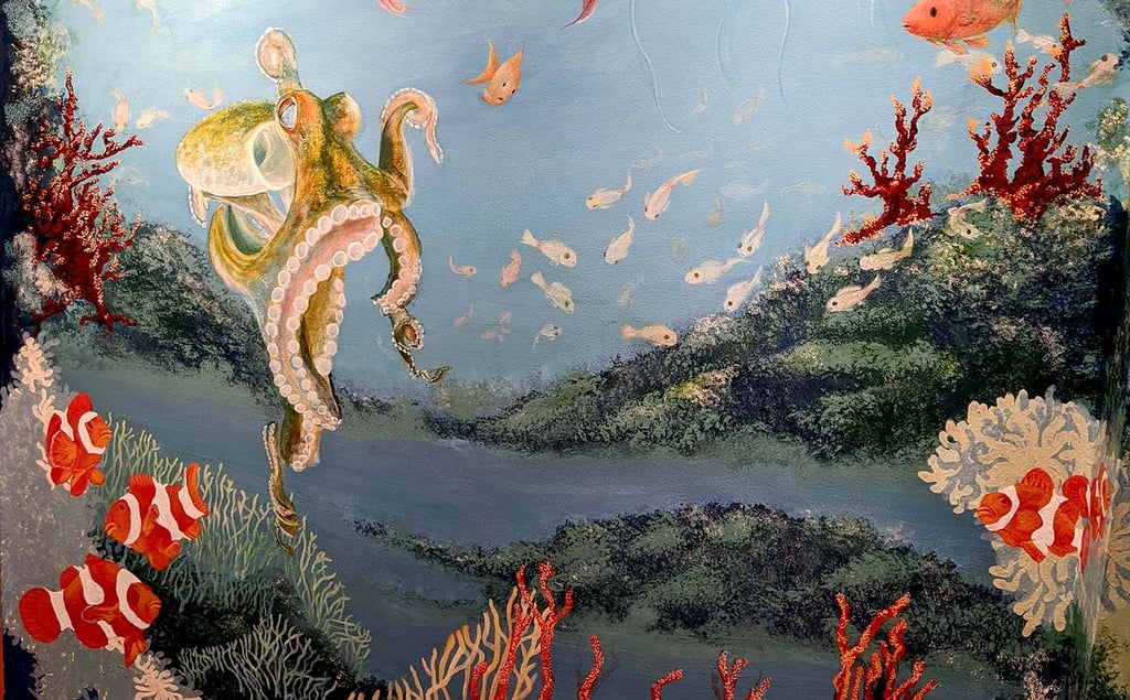
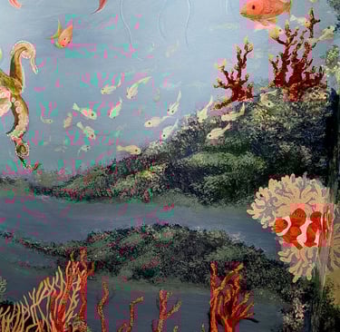
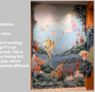
This project had a bump out wall giving us structure to create a 3D affect for added interest and depth of field to the coral reef.
Background, middle ground, and foregrounds were defined and ready for the next step.
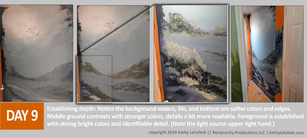
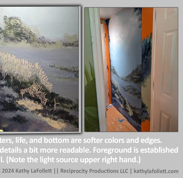
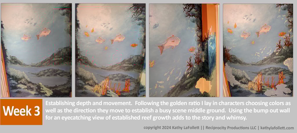
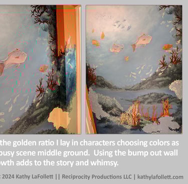
Establishing depth: Background waters, life, and bottom are softer colors and edges. Middle ground contrasts with stronger colors, details a bit more readable. Foreground is established with strong bright colors and identifiable detail.
Note the light source upper left corner. Your light source defines what your viewer will get to see.
Note that I've applied the golden ratio in a vertical manner where the light source is the focal. All life, details, and light will spool out from this point.
Establishing depth and movement. Following the golden ratio I lay in characters choosing colors as well as the direction they move to establish a busy scene middle ground. Using the bump out wall for an eye-catching view of established reef growth adds to the story and whimsy.
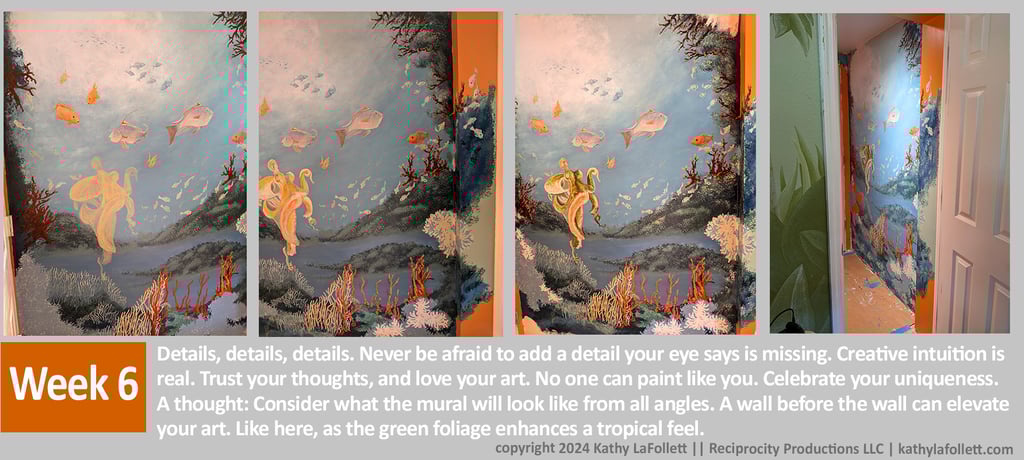
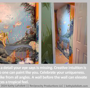
Details, details, details. Never be afraid to add a detail your eye says is missing. Creative intuition is real. Trust your thoughts, and love your art. No one can paint like you. Celebrate your uniqueness. A thought: Consider what the mural will look like from all angles. A wall before the wall can elevate your art. Like here, as the green foliage enhances a tropical feel.

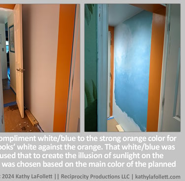
The mural wall and ceiling were painted in a compliment white/blue to the strong orange color for the remaining walls. Notice the white/blue ‘looks’ white against the orange. That white/blue was used in the mural itself as the lightest white. I used that to create the illusion of sunlight on the water surface as seen from below. The orange was chosen based on the main color of the planned school of clown fish.
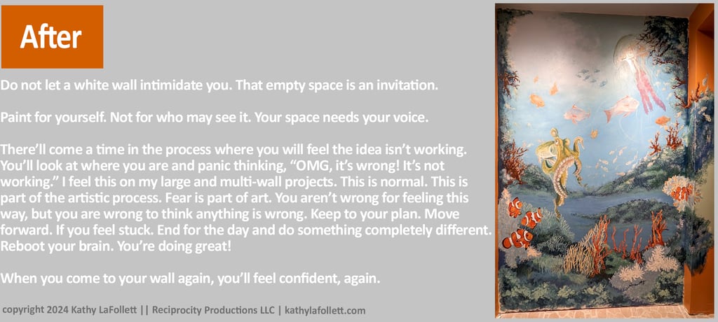
Do not let a white wall intimidate you. That empty space is an invitation.
Paint for yourself. Not for who may see it. Your space needs your voice.
There’ll come a time in the process where you will feel the idea isn’t working. You’ll look at where you are and panic thinking, “OMG, it’s wrong! It’s not working.” I feel this on my large and multi-wall projects. This is normal. This is part of the artistic process. Fear is part of art. You aren’t wrong for feeling this way, but you are wrong to think anything is wrong. Keep to your plan. Move forward. If you feel stuck. End for the day and do something completely different. Reboot your brain. You’re doing great! When you come to your wall again, you’ll feel confident again.
Read How to Care for your Mural. Once you've finished it can last a lifetime.